The human eye can distinguish up to 10 million colours.
How on earth can anyone choose a favourite?

People react universally to colours found in nature, like moss greens, aqua blues, and earthy umbers.
The jury is still out to what intensity, because we all experience colour uniquely.
The next time you view a Van Gogh, the person standing next to you in the museum may be seeing an entirely different version.

Colour affects us psychologically, emotionally, and physically.
It can be used to treat obesity, invoke productivity, and calm patients with mental illness.
Universal human reactions include green and blues as the most calming, while the most stimulating are reds & oranges.
Aside from these, everyone has unique colour connection or sensitivity. Colour can stimulate memories, hunger, communication, strength and serenity. You may be drawn to robin’s egg blue, the colour of your childhood blanket, or comforted by rose pigment because of Grama’s rose water scent.
Thou you may not list “yellow” as a favourite colour, its psychologically the strongest, and the first colour the eye sees.
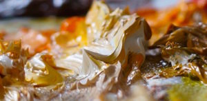
Yellow ochre, a natural clay may not be great for a blouse, but wheat fields shine with it in the sun’s golden glow. Against a cobalt sky promising welcome rain, it can be dramatic and powerful.
Still not sold?
It’s the colour of dijon mustard in your favourite sandwich, golden retrievers, and one of the earliest pigments found in prehistoric cave paintings.
Artists may balance strength of colour with subject.
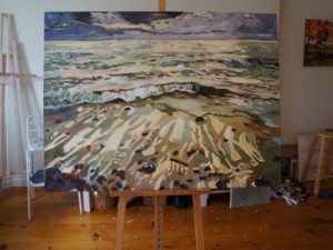
For instance, a softer palette is paired with a dramatic ocean scene of strong pattern and shape.
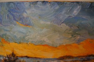
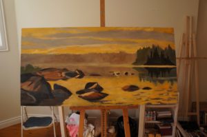
A stimulating tangerine palette applied to a less active composition doesn’t overwhelm, inspiring serenity in the sunset lakeside vista.
The Amaryllis flower, painted in cad red’s contrasts with beautiful sensual line and the irony of a feminine subject displayed on large canvas.

We may react differently to colour at different phases or even days in life. People arriving to the studio stressed are usually drawn to serene, less detailed paintings. Others looking for cheerful powerful stimuli will respond to full pigment paintings. I switch my own personal collection around to support life events & changes.
Delving into your experiences with colour, you may be able to embrace more of the spectrum without judgement.
I cannot remember ever using hot pink pigment. Recently wearing a cycling jersey this colour kept me road safe and feeling spunky. It just may find it’s way to my palette.
Inquiring about the Amarylis painting a client said “I am drawn to red at this point in my life.” It’s an exciting time for her filled with wonderful new beginnings.
Here’s to summer friends! May mossy green forests, golden ochre fields, cobalt skies, tangerine sunsets and happy red flowers light your life.
~
Robert Genn Aug. 7th. 2012.
“Some painters nail the exact colour they need on the first go. I’m not one of them. In my experience, 90% share my problem. Colours change as the colours change around them — and you can’t know the colour of a passage until you’re picking up what you’re putting down. The situation is compounded by the presence of (or desirability for) reflected lights, silhouettes, local colours, broken colours, cast shadows, equal intensity lay-bys, etc. Finding the right colour can be like looking for the Higgs boson.Understanding how colour works is largely a self taught skill.”
“Colour is a power which directly influences the soul” ~ Wassily Kandinsky.
Sunset – 8×10 oil on board $455.oo
Lakeside 16×20 oil on canvas $935.oo
Ocean – 4ftx3ft oil on canvas $3950.oo
Evening Light 4ftx2ft oil on canvas $3600.oo
Amaryllis 30×40 oil on canvas $2700.oo