Brand recognition is a strong element in business today.
It’s advantageous if brands are unique and consistent with a clear mission, because we are inundated daily with information.
This is also true in the art world.
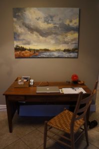
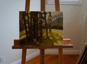 “Meadow” New 11×14
Beyond an Artists Signature style, branding may encompass original and recognizable features of their art, personality, or how they work. ( ie: showmanship, tools, unique materials, etc)
Below is my favourite painting by a certain famous artist. Recognize the work?
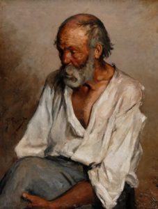
You may not, because “The Old Fisherman” was painted in 1895 before Picasso evolved to his more recognizable style, founding the method of Cubism.
Landscape painting is highly competitive, perhaps the easiest genre to be lost in the crowd. “You landscapers are a dime a dozen” one dealer told me. Being distinguishable in the sea of thousands is one of the biggest issues professional artists face.
That’s why many are devoting time and attention to their brand.
Last month a new client strolled the studio. “It’s difficult to recognize all of these works were done by one artist. This must be hard for your brand?”
What followed was one of the most exciting conversations I have had in the studio.
By putting me on the spot, I was able to focus on his perspective as a collector and avid supporter of original art. He’s given me insight what may be obvious to me, may not be to the public.
My response was:
1) I can connect with my subject on a deep emotional level in a short period of time.
I paint a variety of landscapes having been fortunate to live in some of the most beautiful places in Canada as an adult. We were raised in lovely remote provincial parks growing up. Having this unique relationship with the land since I was a child has given me the adaptability to form a very quick connection to natural spaces everywhere.
2) Colour.
I have never used a colour wheel, so my palette is uncommon. I mix all colours by instinct. You will find the use of Cad yellow’s in nearly every single painting. I use a combination of at least 3 yellows to achieve a golden effect.
3). Fresh Air/ Plien Air feel
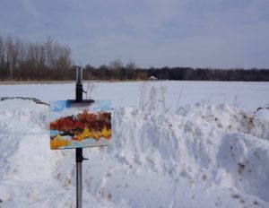
Thou my technique changes because I use a variety of tools, bare hands, brushstroke in the work, I am told it embodies the raw freshness of outdoor work. Vibrant colour, thick strokes, bold design help achieve this.
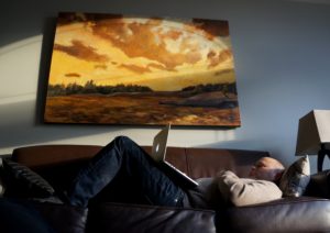
4) The largest focal point brought to my attention by dealers, collectors, and the reason I was chosen for the boreal expedition is the way I paint light. I am told this is the work’s outstanding feature.
New logo look highlights the play on my name ~Sunrise~. click here.
In the spirit of branding, I am working with my friend Dayna, for the “Dawn” art brand, so exciting! Watch for updates in the future!
~Note: “People say your work is similar to the Group of Seven, I disagree. Seeing their work, I feel cold and traces of (distress)? It makes me want to put a sweater on. I see happy warmth in your work.You don’t have an angry bone in your body, I just feel.. happy”. new Client.